Kayo
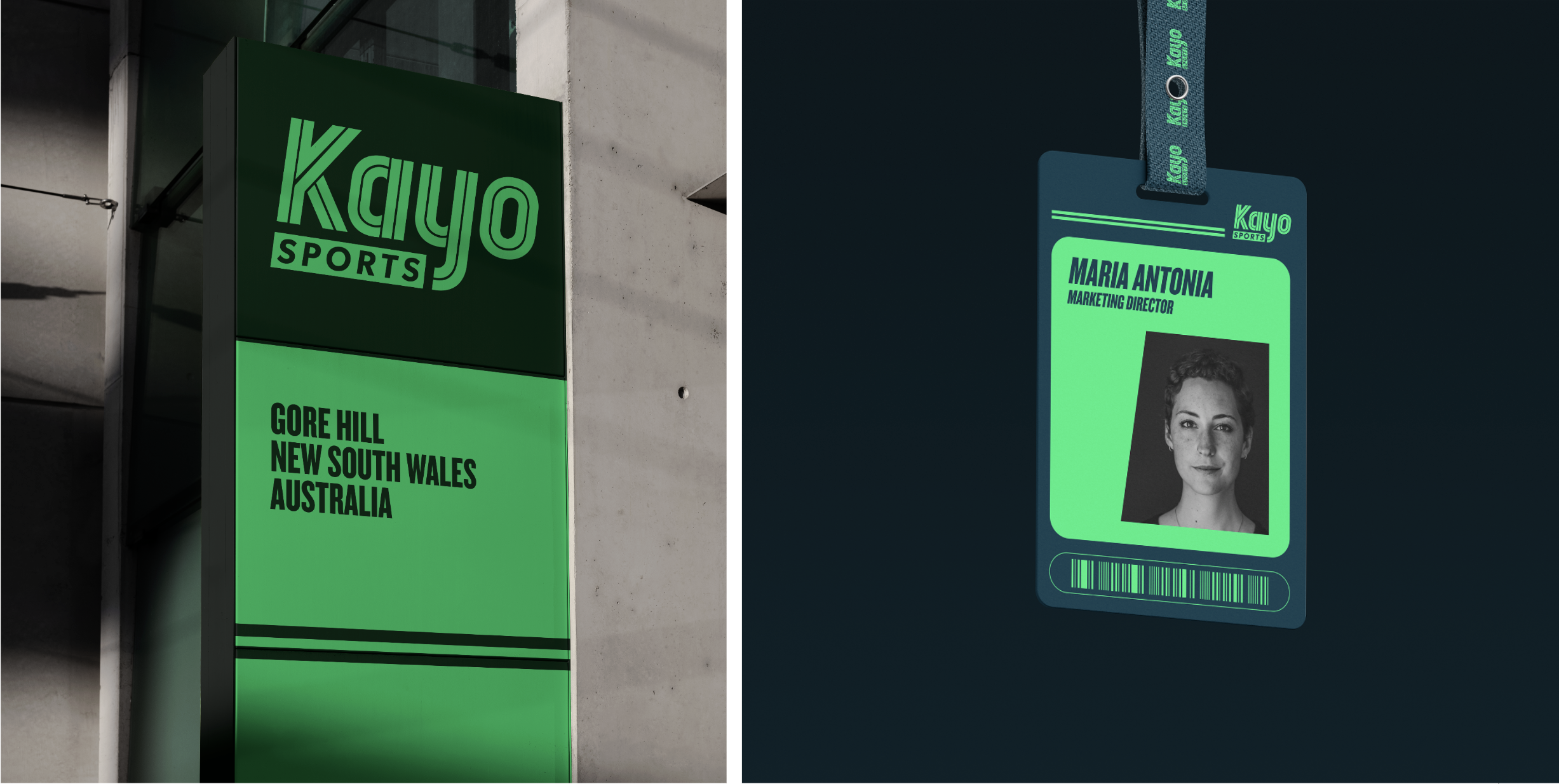
Kayo is the home of sport, yet its brand presence felt more like an observer than an active participant. Kayo sought to reenergise its identity, capturing a dynamic and vibrant spirit that reflects its role at the centre of memorable sporting moments. Built on simplicity and the lively essence of sport, Kayo’s brand design centres around a unique logo mark composed of two intertwining lines, symbolising unity, connection, and the effortless flow of energy. This enables Kayo to take on a powerful, engaging presence. We introduced the bold and assertive Knockout typeface, complemented by an expanded colour palette for versatility. This brand system goes beyond visuals, embodying the commitment and deep connection that defines the world of sports.


Credit: Special Group